
Case Study - Meeting of the Minds
- Kelsey
- Oct 3, 2023
- 3 min read
2018 Conference

When I began working for Self Opportunity in 2018 I was tasked with creating a 50-page booklet of all of the speakers, sponsors, advertisements, and attendees for that year. Being just one person and only having a few months to come up with an entire booklet (while still taking care of my other projects and responsibilities) was a big undertaking as a fresh-out-of-college designer. So together with the rest of my department we settled on a design theme, found a starter booklet on Graphic River and I got to work.
Ultimately I ended up changing just about everything from the starter booklet... I don't think I kept a single page with the same layout or design... I guess it was just a fallback in case I needed a page created quickly. In the end, this was the result. And while a lot of compromises had to be made to please my bosses and the clients, I believe it turned out pretty well.

During that time I was also tasked with creating a brand new website for the Meeting of the Minds conference. As you can see to my left the content on the site has been modified to reflect the 2020 conference, but the site was actually created in 2018 and has been utilized by us for the last 2 years.
On this site, we list everything from our Agenda, Attendees, Speakers, Sponsors, and Tickets, all of which are continuously updated and edited up until the day of the conference itself.
We used WordPress as the site editor, so I have experience with products such as the Divi Builder and WP Bakery.

To check out the full website visit: www.MOTMCON.com
During this whole creative process, I learned a lot about design and compromise. While I wanted to take things in another direction, I had to compromise and create pieces that were more utilitarian instead of "pretty".
An entire conference comes with a lot more design than I ever imagined. Between a booklet, a website, a new logo, signs, marketing, and social media, I was busy.
But I managed to create them all (granted maybe not the exact way I wanted to, but hey there are deadlines to hit!). To the right are some of the other things that I had to make for the conference including the logo design, 2 Twitter pieces with quotes from the speakers, their signs that were displayed outside of their speaker rooms, and 2 marketing pieces for some of our speakers. It wasn't easy, but it was rewarding, to say the least.
2019 Conference
The 2019 Meeting of the Minds offered a lot of the same struggles as the previous year, but I felt more able to combine my design choices with the product.

We still purchased a started booklet from Graphic River, but again I pretty much changed every page and made it my own.
We also went with a more monochromatic color choice for the theme, which I prefer way more than the previous year.
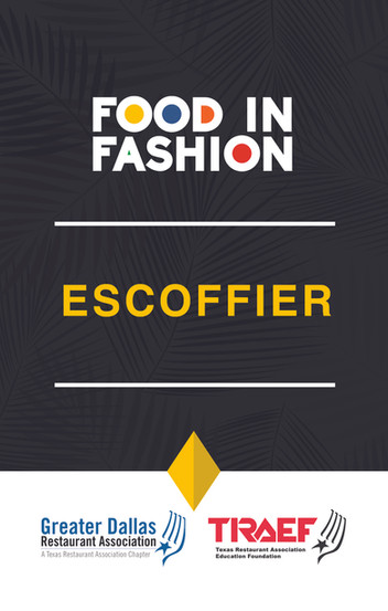
Along with the logo, booklet, signs, and marketing materials, I also was able to create the name tags this year! I was very excited about it because it was a new challenge. I have created name tags before for my company, so this was bound to be fun!

This was the final design, and I have to say I was pretty happy with it. Again there are always going to be compromises in company design, but I think this year I was able to use my skills in a more effective way.
This year I really felt like I was able to flourish as a designer. Of course, there are always things I will criticize about myself, but I feel like I had the final say in the majority of the design choices and I think that really boosted my confidence as a designer.
Every year comes with its own challenges, but ultimately it's what you make of your situation that really shows who you are. Through all of the struggles and hardships, I feel like I came out on top with this project.
Here's a gallery of some of the other assets that I created for the Meeting of the Minds:


Comments